F
Interactive election graphics
Beyond ‘red states and blue states’
Slides: www.martinstabe.com/elections
Source: Rich Gordon, Knight Lab, Northwestern University
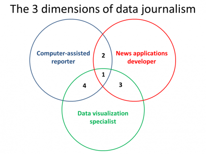
What we do
- “data journalism”
- “interactive data visualisation”
- “interactive graphics”
“News applications”
“a large web-based interactive database that tells a journalistic story using software instead of words and pictures.”
— Scott Klein, Propublica
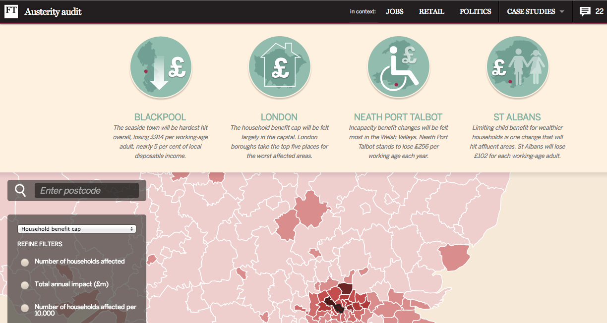
News applications
Some characteristics of effective news apps:
Martini-glass narrative
“...following a tight narrative path early on (the stem of the glass) and then opening up later for free exploration (in the body of the glass).”
Source: Edward Segel and Jeffrey Heer, “Narrative Visualization: Telling Stories with Data” (2010)
Elections
- Data-rich
- National outcome
- Local detail
Elections everywhere!
- “Around 40 national elections will take place in 2014, representing 42% of the world’s population and more than half of its GDP.”
Source: The Economist
... including this week.
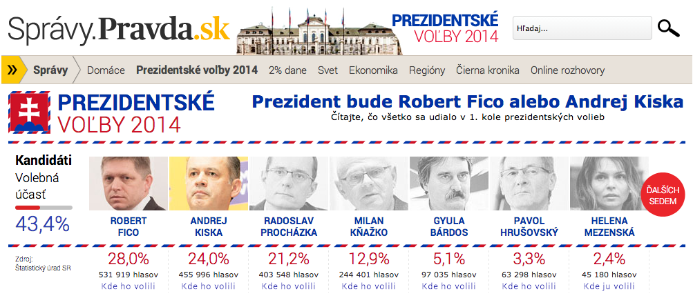
Source: Pravda.sk

Maps!
The election choropleth: a short history
Election map, 1896
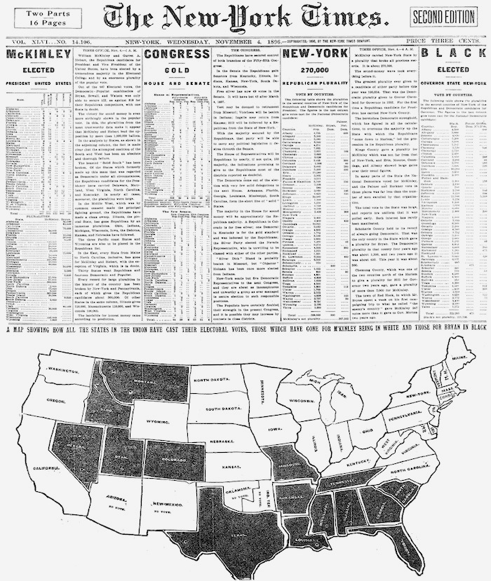
New York Times, 1896
Source: Matthew Ericson
100 years later: 1996
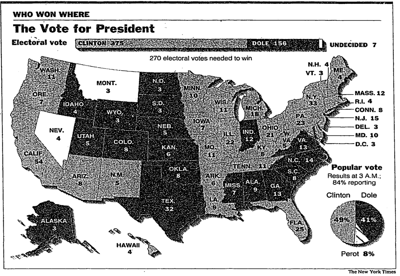
Source: New York Times
104 years later: 2000
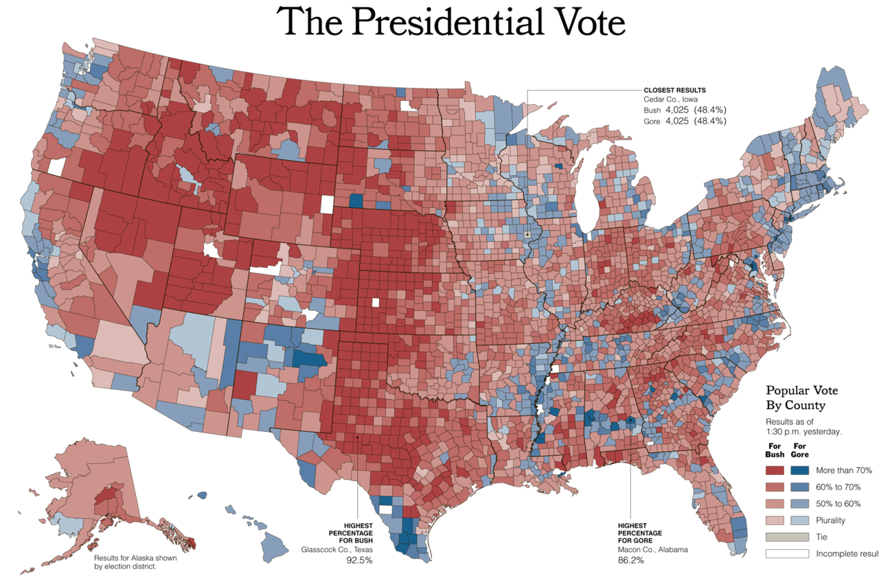
Source: New York Times
Now, with interactivity
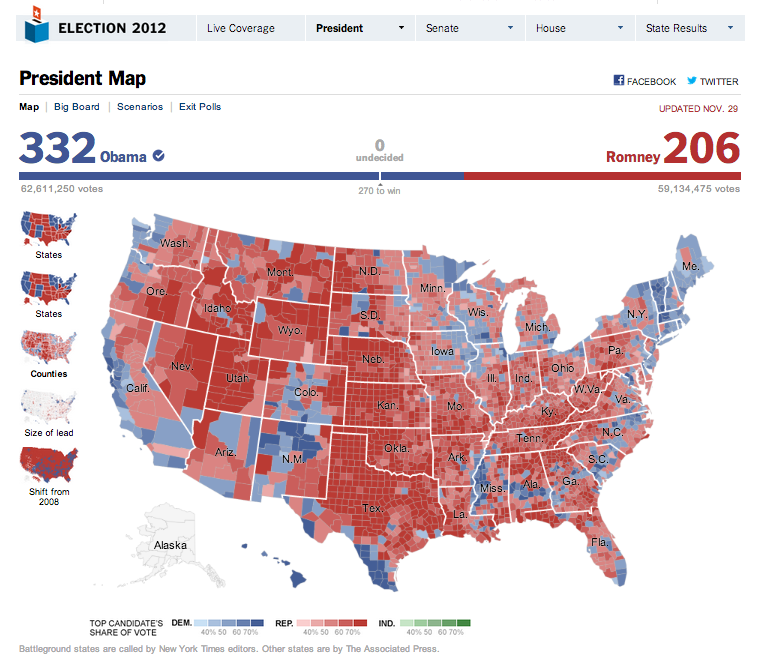
Source: New York Times
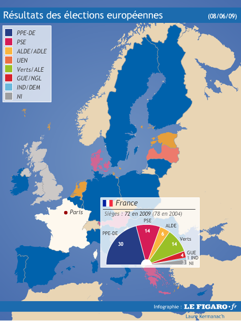
More data!
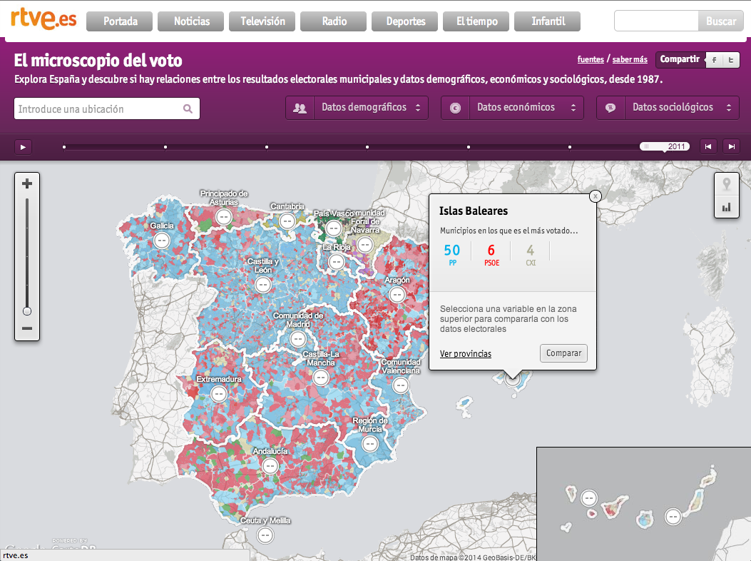
Source: RTVE
Smaller units!
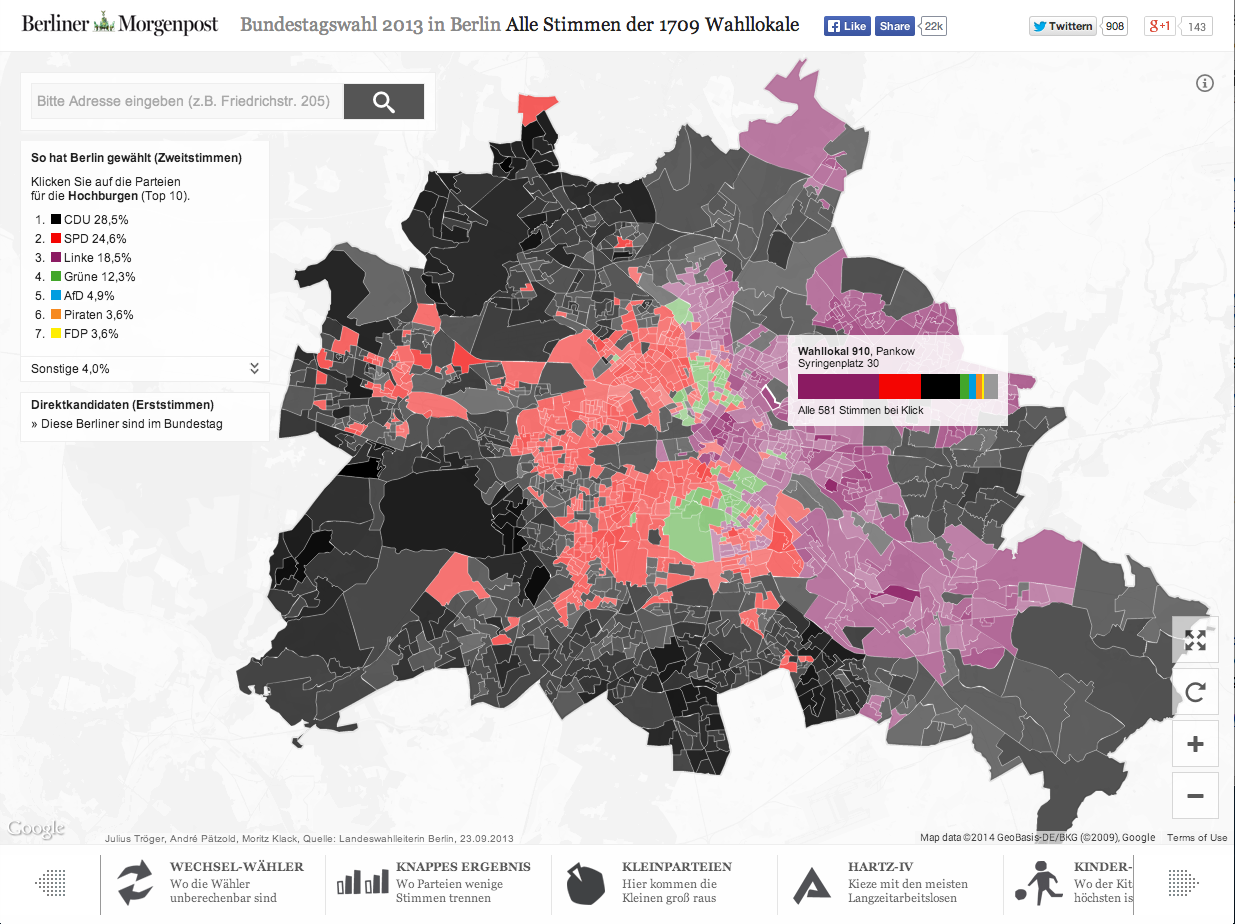
Source: Berliner Morgenpost
Choropleth problems: one variable per unit
Source: Economist 2014
Solution: User selection
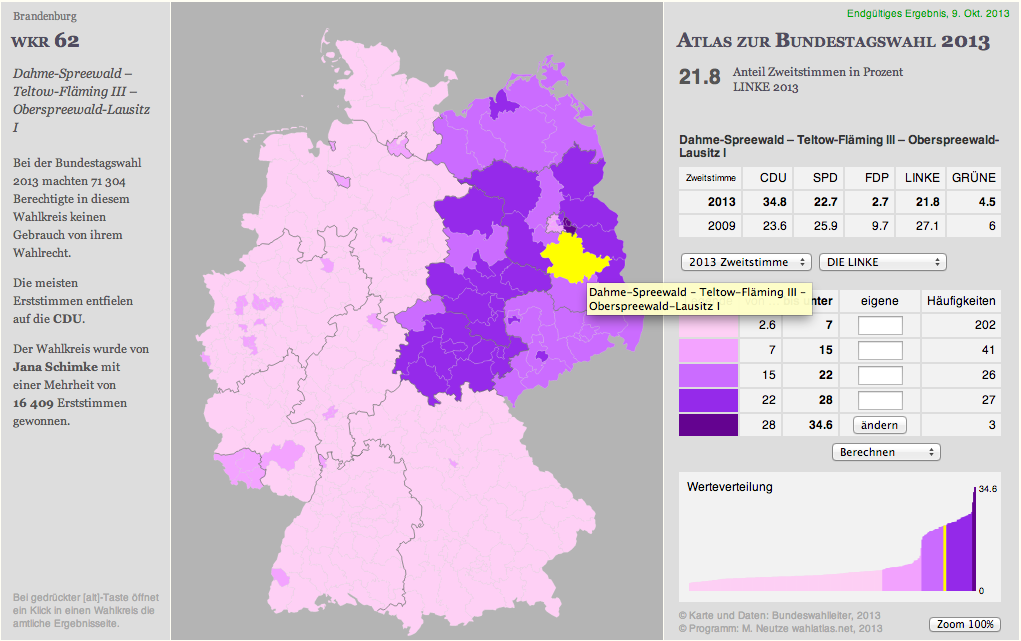
Source: Wahlatlas.net
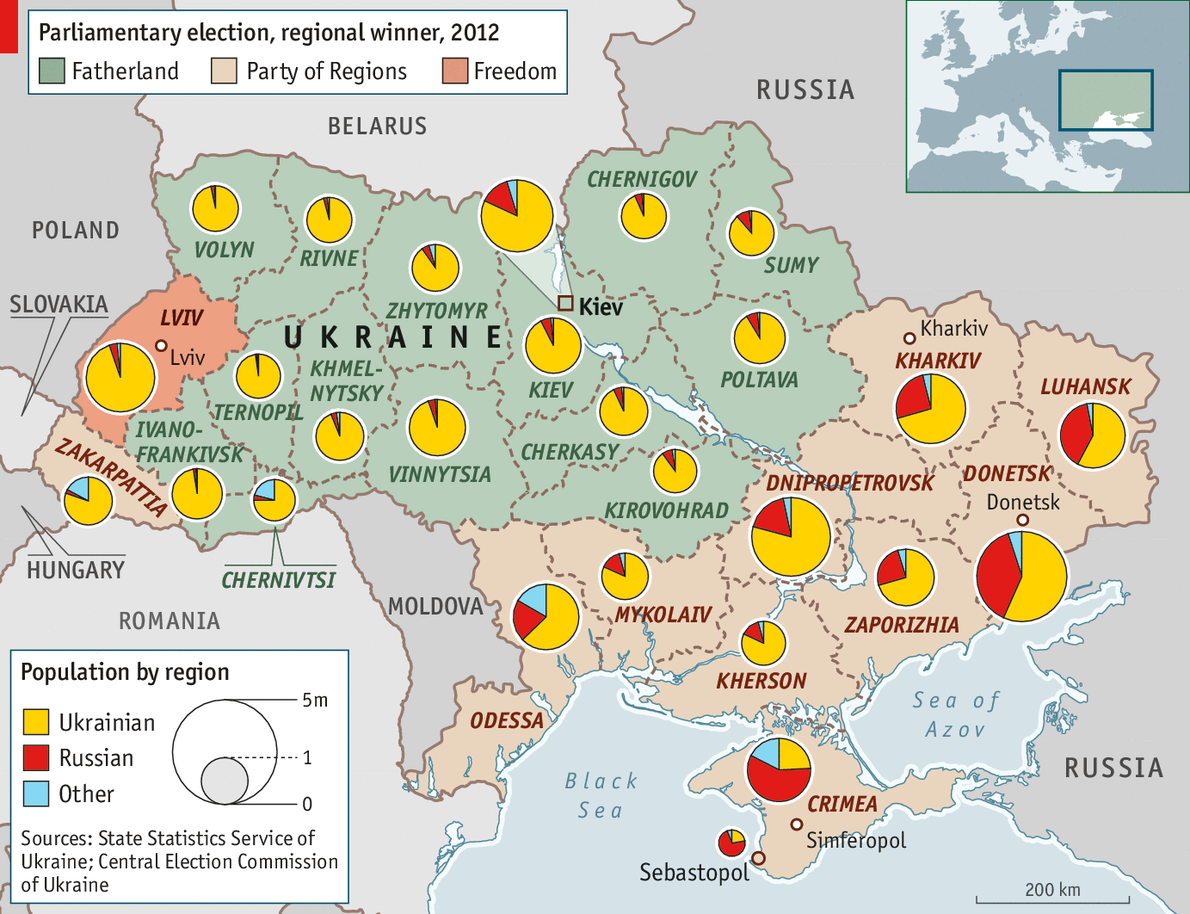
Especially problematic in PR systems
Source: Le Figaro, 2009
Choropleth problems: one variable per unit
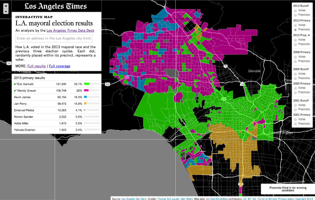
Source: Los Angles Times
Dot-density maps: individual voters
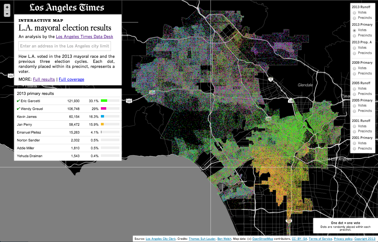
Source: Los Angles Times
Choropleth problem: uneven population density
Source: Los Angles Times
Cartograms instead of maps
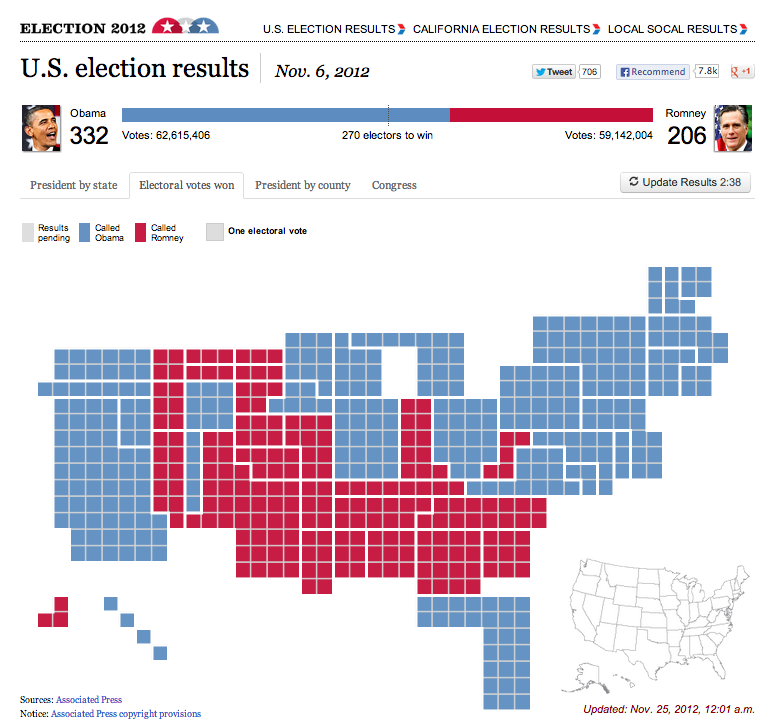
Source: Los Angles Times, 2012
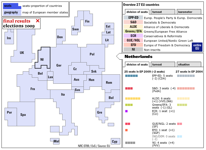
Same problem in Europe!
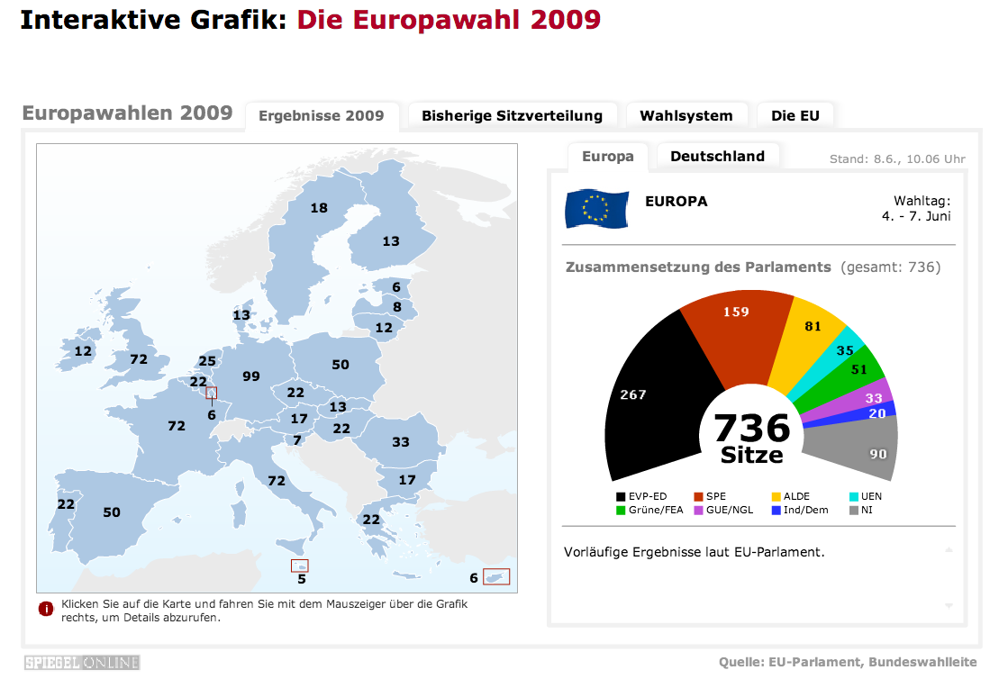
Source: Spiegel Online, 2009
Same solution in Europe!
Source: NRV, 2009
Maps!
Cartograms
First attempted in 1964
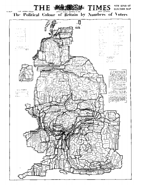
Source: The Times, 1964, in Danny Dorling, “Area Cartograms: Their Use and Creation”
My current favourite
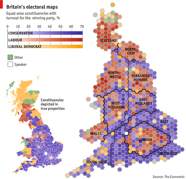
Source: The Economist, 2013
Maps!
Is geography really the story?
Poll trackers
Poll tracker, DR.dk
Poll aggregation
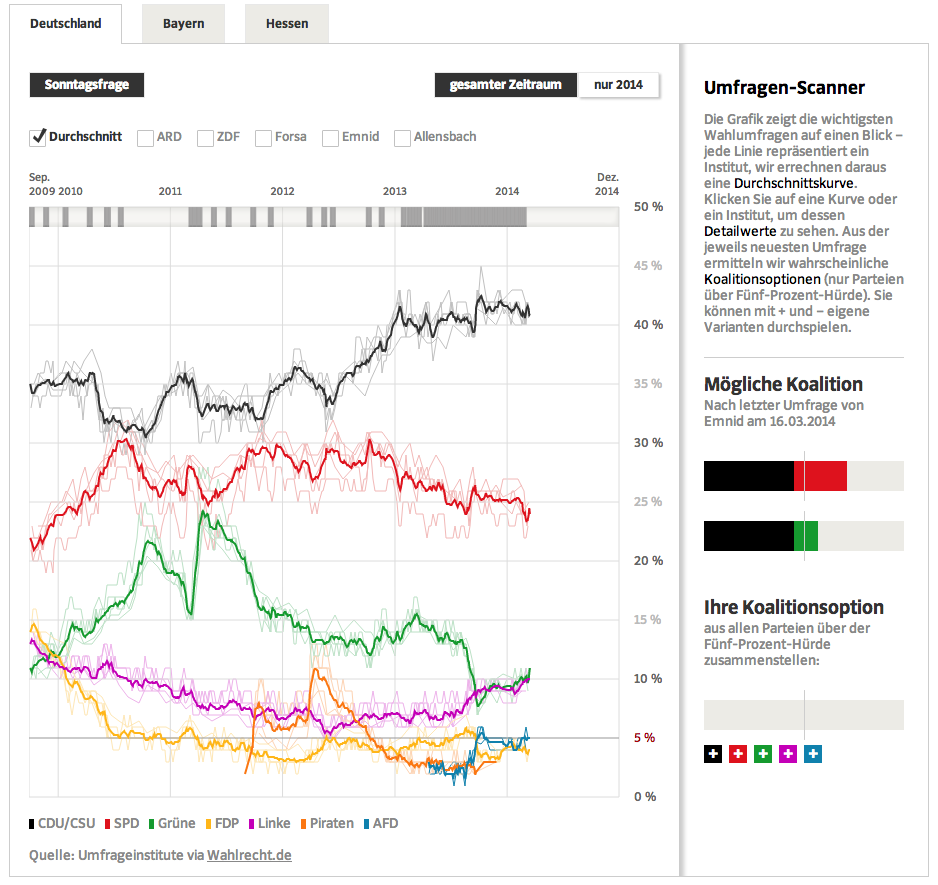
Poll tracker, Süddeutsche Zeitung
Showing margins of error
Poll tracker, Huffington Post
Pre-election scenarios
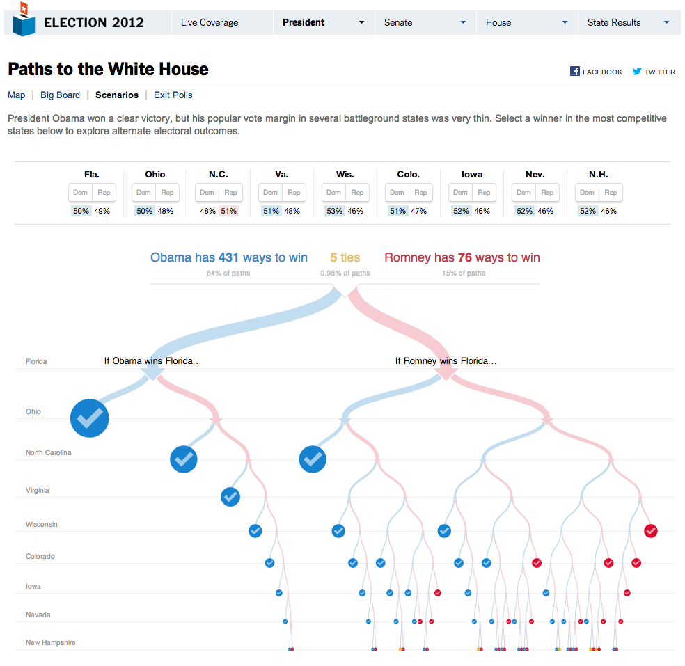
Source: New York Times, 2012
Shifting election-night coalition scenarios
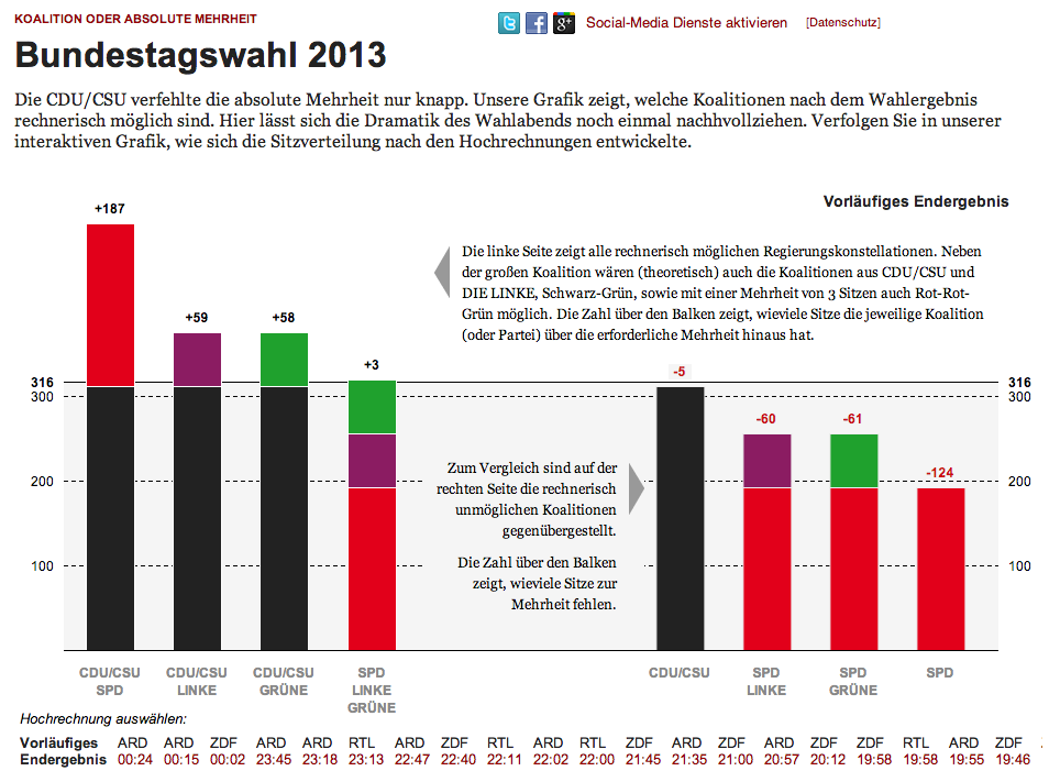
Source: Zeit Online, 2013
Votes to seats: Hemicycles
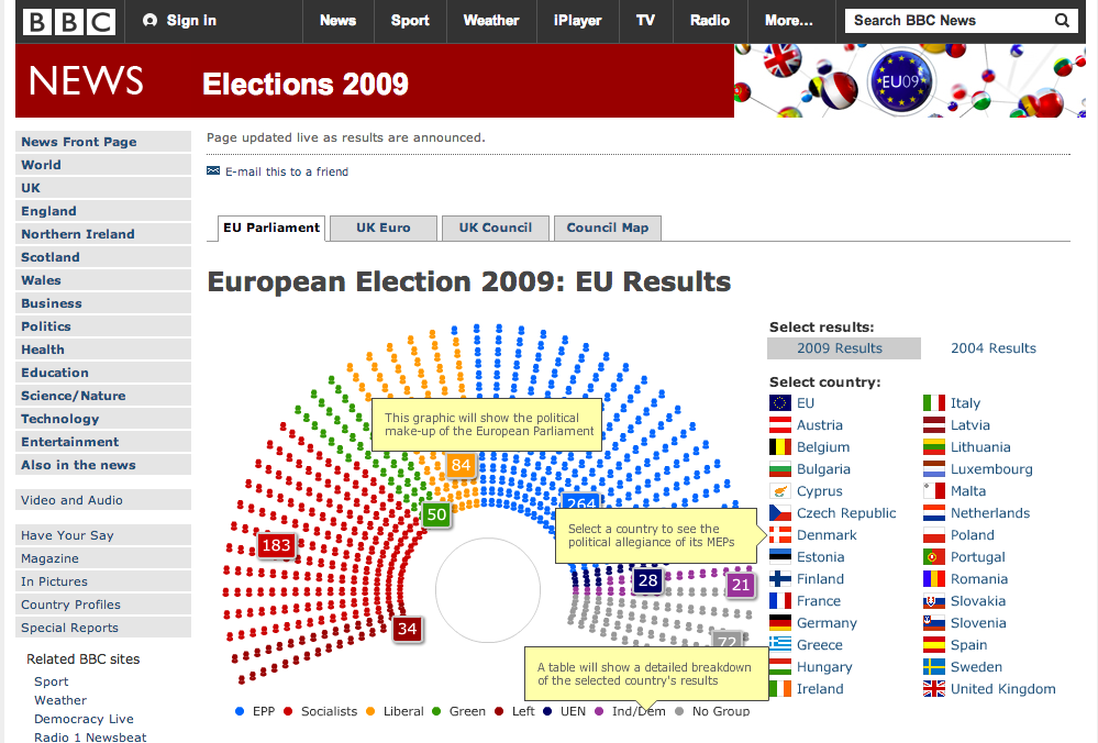
Source: BBC, 2009
Spot surprising results
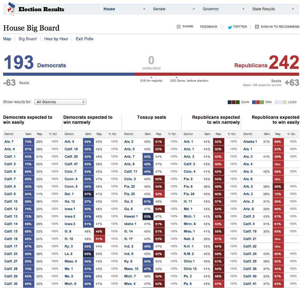
Source: New York Times, 2010 via Matthew Ericson, “When Maps Shouldn’t Be Maps”, 2010
Responsive design
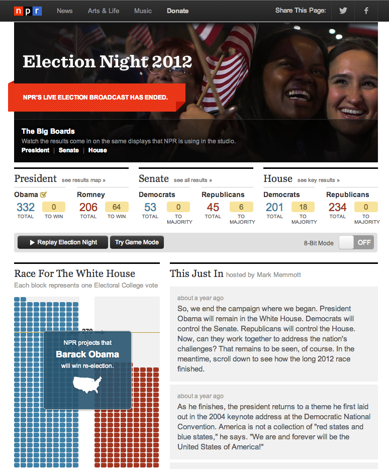
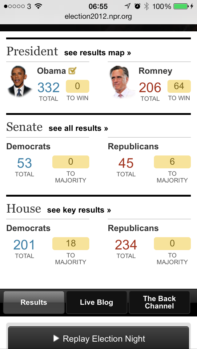
Source: NPR, 2012
Slides: www.martinstabe.com/elections